 Platoon Manager
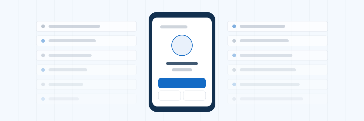
The roster gets used standing up, outside, one-handed, often in the dark. That constraint decides more about whether a tool gets adopted than any feature list.
The screen you need is one screen
At the formation there is exactly one job: go down the list and mark people. Anything requiring a menu, a filter or a back button is friction at the worst possible moment, and the fallback is a notebook.
A good version asks about the people who are actually unaccounted for, in rank order, skipping the ones already known to be away. What is left is a short list and a decision per person.
Tap targets and gloves
Buttons sized for a mouse do not survive a cold morning. Everything you press during a formation needs to be a real target, and the important ones should be near the bottom of the screen where a thumb reaches.
Do not make people type
Typing a reason on a phone outdoors is how a tool stops being used by week two. The common reasons should be buttons. Free text should exist for the odd case and be optional everywhere else.
The count has to survive a bad signal
Motor pools and ranges have poor coverage. A tool that loses the marks when a request times out teaches people not to trust it, and one bad morning is enough. Whatever you use, test it somewhere with one bar before you roll it out.
Rank order, so the list makes sense
A formation goes down the roster in an order people expect. A tool that lists soldiers alphabetically, or by the order they were entered, forces whoever is holding it to translate between the list and the formation in front of them. Rank order costs nothing to implement and removes an entire category of "wait, go back".
The same applies to who gets asked about. If a soldier is already recorded as being on leave, asking about them wastes time and invites a wrong answer. They should be skipped and shown at the end as already accounted for, so a mistake in the record can still be corrected on the spot.
Whatever is on screen must be one thing
The failure to avoid is a leader tapping the wrong soldier because two rows were close together and the bus was loud. One person per screen with large buttons is slower to read about and faster to use. If your current method involves scrolling a table during formation, that is where the errors are coming from.
It should already be on the home screen
Anything that starts with opening a browser and finding a bookmark adds fifteen seconds to every use. A roster people actually use is an icon on the home screen that opens straight to the formation.
Related
Run one formation with it
Platoon Manager has a formation mode built for exactly this: full screen, one soldier at a time, unaccounted only, in rank order, with the reasons as buttons. Add it to your home screen and use it for one morning before you decide.